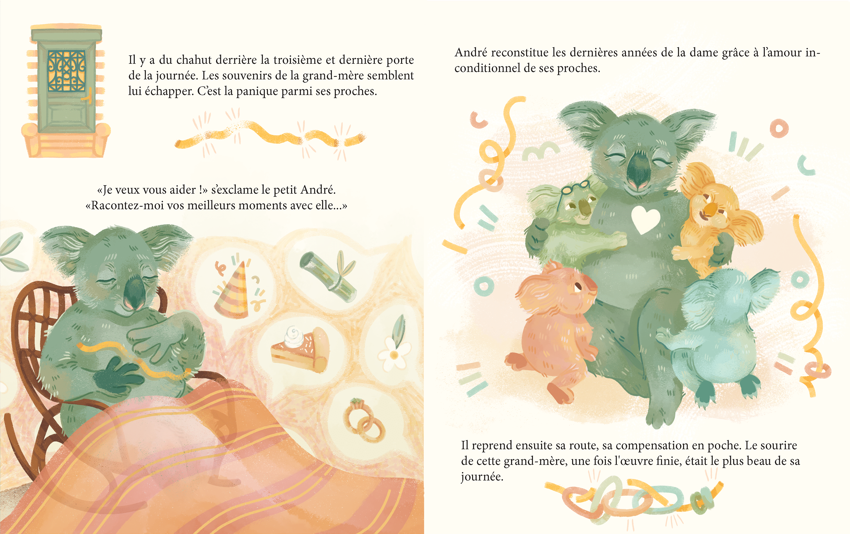
If last August I based myself on a previously published tale to practice my illustration skills, “Lucie et les Lucioles” by Arnaud Moine and Mayalen Goust (ed. Chocolat ! Jeunesse, 2009), this time I wanted to illustrate an original manuscript. I didn’t think too much about it, I wanted to illustrate a little tale, a short story, without pretending to call myself an author (or not yet, anyway ☺️). My main objective was to illustrate on the basis of a text, certainly, but without being influenced by pre-existing illustrations. I like to think that it takes practice, going step by step, for me to feel comfortable, but above all legitimate, in the art world.
I needed constraints, so I thought it was fun to get my little community involved on Instagram. I’m not really comfortable with social media yet, so I thought it was a good idea to break the ice!
PFor this project, I, once again, gave myself 3 constraints. 🖍️
- To have a more limited palette than usual (sepia, blue, yellow and pink).
- To have a bright, light atmosphere articulated around the white of the page.
- Have only anthropomorphic characters.
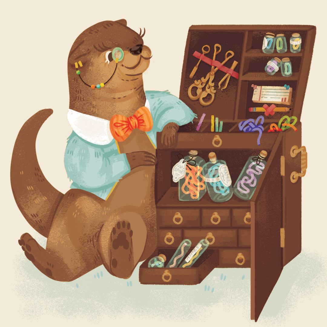
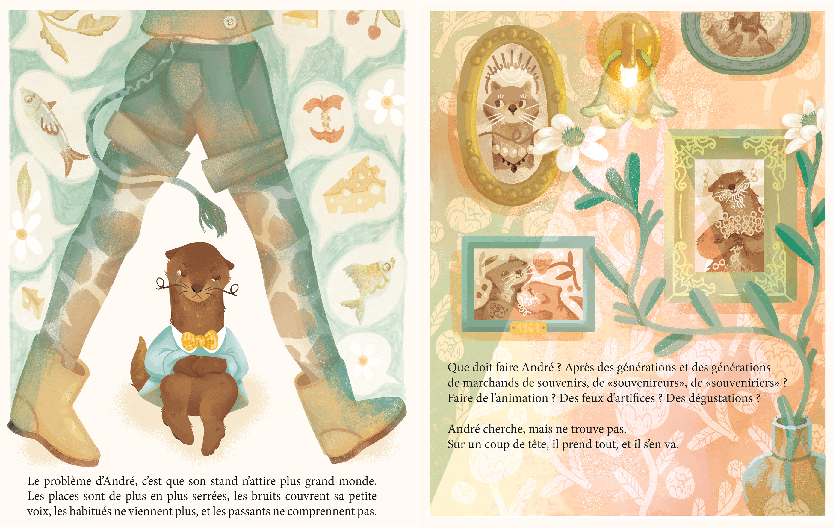
Aesthetic research for the creation of the Souvenirs Shop, I immediately fell in love with the cabinet of curiosity or antique shop of memories aspect
This small project was an opportunity for me to get out of my comfort zone. I’m used to hyper-colourful images, with very little empty space, so I took this opportunity to adopt an aesthetic that is still poetic but more delicate than my usual.
I had a lot of fun building my storyboard in stages:
- First, by dividing the text into pages and identifying which ideas would be illustrated where, to best accompany the story carried by the text.
- Then, by making a draft, with different values, to already perceive a little the composition of the pages.
- And finally, the final illustration, in colour!
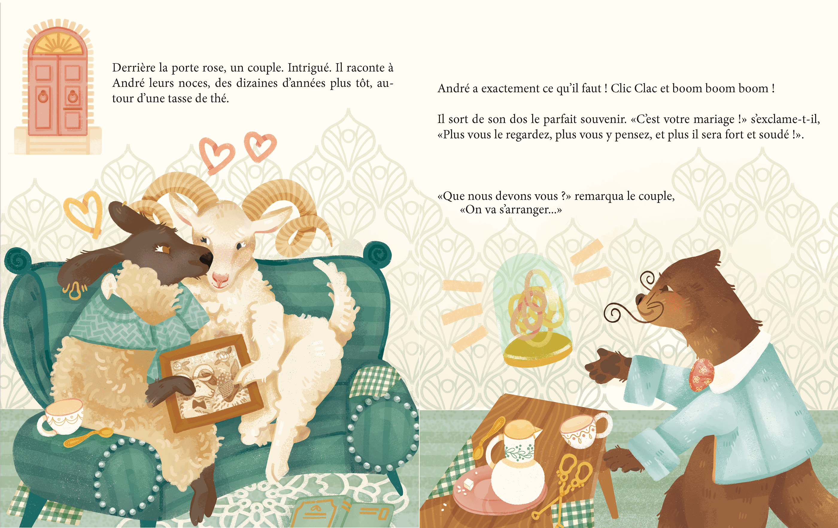
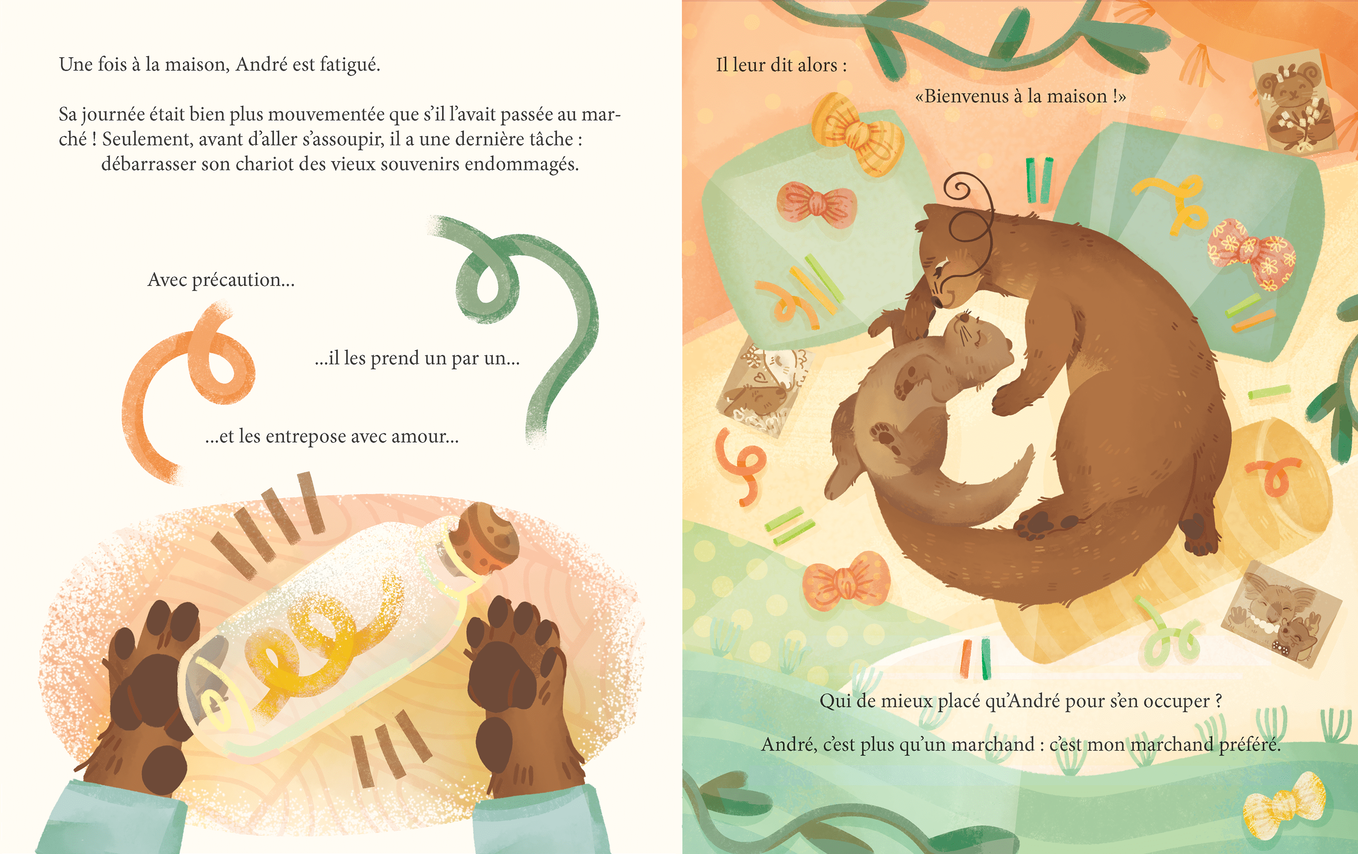
I was able to experiment with the composition of the pages, the aim being to make the reading more dynamic by never allowing redundancy to set in. I hope I succeeded!
I also really enjoyed playing with the characters and their identities. It was stimulating to think about the different ways of showing personality in animal characters. Big favorite for André, the coquettish and sensitive otter! 😍
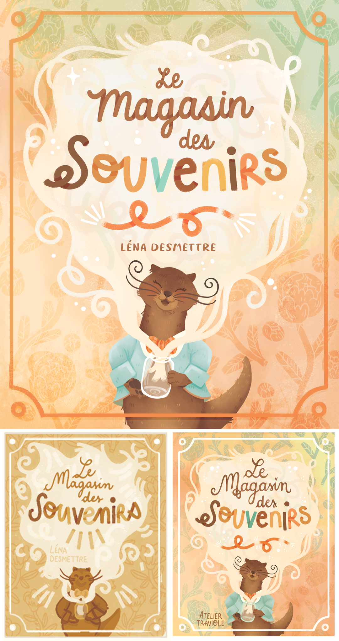
My cover for "The Souvenirs Shop" and related drafts
This time again I illustrated a cover for the Souvenirs Shop. I was sure I wanted to see: the otter, from the front, a jar, memories and the wallpaper pattern of André’s house.
As I couldn’t decide between the first and second proposal, I thought it would be a good idea to have my subscribers vote. As if to come back to the origin of the project, “la boucle est bouclée” as we say in French, hihi.
This project allowed me to clear my head a bit at a busy time in my life. It felt good not to have to think for too long, just to let the words flow, following my plan and still using the same color palette. It was a good way to take my mind off things, without adding too much mental load, while at the same time managing my back-to-school season. ⭐
This project has been formative, as I would never, on my own, have embarked on a project about an otter that gives out memories and smiles.
Looking back, this little manuscript, and all the illustrations attached to it, have allowed me to move forward a little more as an artist. Now, I know that writing my own manuscripts is a strong, difficult thing, but one that I would like to try one day. However, for now I will continue to focus on illustration, I have plenty of time to try my hand at writing professionally! I have a lot of respect and admiration for authors, so if you write and you come through my site: thank you for giving us so much to read! ♥️
Links to continue reading…
AUGUST 2021: Lucie et les Lucioles My previous illustration exercise, based on a previously published children’s book…
Links to explore…
My instagram, where I conducted this experiment
The Original Manuscript (PDF FR) by Léna Desmettre
